Data is one of the primary factors that are driving change in the world. It doesn’t matter which industry you’re from or what your fields of interest are; you will undoubtedly have to deal with data. It might be data from a study conducted to find a cure for a disease or data to be considered to make a business more efficient and profitable.
Whatever may be the case, the importance of data cannot be understated.
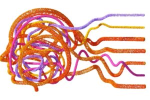
But sometimes, the data can be too complex to understand. This is why data visualization is essential. It’s the key factor that can help someone analyze vast amounts of information and make decisions based on data-generated insights.
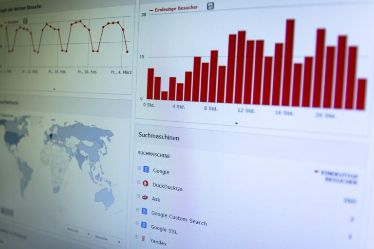
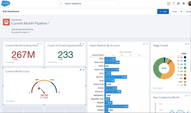
There is something more important than data visualization as well – dashboards! So, what exactly does a dashboard do? Dashboards are a great way to pin and organize your data with different sections, graphs, maps, datasets previews, forms, etc.
The only thing that you will need to take care of is to display information that is useful. However, dashboards can still fail. Though many factors can contribute to its failure, dashboard design mistakes are the most common ones. Such mistakes can be identified with the following:
- What data needs to be incorporated or excluded from the dashboard?
- How is the data filtered to focus on specific information from large datasets?
- How relevant and updated is the data?
- What sort of graphs are used to convey different types of information?
- What contextual data is displayed or missing?
Having mentioned that, the following post describes how your dashboard design can be on point and bring forward opportunities to present data in the most creative way possible.
- The dashboard should target a specific purpose
The dashboard should be designed to serve a particular purpose. There are different well-known approaches to categorize the dashboard into analytical, strategic, operational, tactical, etc. each based on a particular purpose.
Generally, they fall into two broad structures – operational and analytical.
Operational dashboard works best for users involved in time-sensitive tasks. In addition to imparting crucial information, it offers a clear view of the data deviations as well as their current resources and status. The operational dashboard also acts as a digital control room to view support actions and gain proficiency in their tasks.
Analytical dashboards offer the overall information at a glance to help users analyze the data and make appropriate decisions.
Depending on specific user roles, you need to decide which dashboard will be suitable. Usually, low-tier managers use an operational dashboard, and higher management will need an analytical dashboard.
- Focus on selecting the proper representation for the data
Charts are an important aspect of dashboards. As the dashboard presents multiple types of data, including static and dynamic ones, representing them can be quite a tough task.
You need to be careful while selecting the chart type as it could confuse the users and result in the misinterpretation of data. Therefore, it’s recommended to have a look at the internal documents to have a basic idea.
Scatter charts, bubble charts, and network diagrams are some graph types that can help users understand the relationship in data.
Column overlap charts, circular area charts, and line charts are probably the most used graph types to make it easier to compare values.
Pie and Donut charts should seldom be used owing to their inefficiency to convey proper information. Such charts usually include similar values and many components, making the data hard to read.
Distribution charts work quite well to help one understand outliers, the typical tendency, and the scope of data in your values.
However, there are some chart types that you should avoid using like gauges, 3D charts, and over-styled charts. They are tough to create and also distract the viewer from the important parts or data. You can consider the following questions to decide which representation type will go well with your requirements.
- How many variables are you planning to put in a single chart?
- How do you intend to display values among items or groups?
- How many data points do you think will each variable require?
- Maintaining consistency
The major purpose that a dashboard should serve is to help the user comprehend the message by looking at it. Therefore, you need to make sure that every small thing is taken care of.
You should also focus on using a clear framework to ensure consistency of data. It will be a lot easier to use the tools if you follow similar naming conventions with your data.
- Choosing the right layout and flow
Grids and modules can prove to be very effective in ensuring alignment and consistency as well as to create a basic structure for your design. You can position your design elements on the invisible lines that the grids offer.
Thus, the elements are clamped together in the overall system, leaving you with a rational composition. That’s critical for a great dashboard design as that helps organize huge volumes of data seamlessly.
Consider the points below to decide which information needs to go where:
- As we tend to give more of our attention to the top left corner of the screen, it’s advisable to put the vital information arranged from left to right. Also, that is how we generally read information.
- If a group of the information displayed at one point is based on the information from another point, you need to develop a layout that has a continuous flow. This enables users to scan through the information without going back and forth.
- Adding widgets to the dashboard design
After you’re done with defining the grid, you can move on to the next process of working with widgets. Widgets are applications that help with tasks like holding the info, charts, and controls. Here, cards can be of great help.
Cards can be manipulated almost infinitely. They act as content containers and can organize information into meaningful sections, making it an excellent choice for responsive design. Also, the data in cards are easily digestible for users as they can easily access the data that interests them.
Another major characteristic of cards is the consistency they offer in the layout of controls and data inside. One can simply assign the top left corner for putting in the name, align view controls to the top right corner, and use the rest for adding the content.
Working with the interface becomes a piece of cake when there’s a consistency in the structure of everything. Furthermore, it’s also beneficial for improving the overall scalability of all your designs.
- Paying attention to white spaces is important
You need to have the right space between the design elements. It’s also known as white space or negative space. It can be a texture, pattern, or merely the space between typography glyphs.
Readers might not be completely aware of the importance of the white space, but designers invest much attention and efforts in it. The use of white spaces is vital in creating a good design and ensuring elegance and quality user experience. But some clients and managers think of it as a space that’s wasted.
They feel that it could deliver a better use if it could hold more information or visual elements. On the contrary, it can make data very hard to read and comprehend if the white space is not balanced. Therefore, paying attention to adding appropriate white spaces is as important as any other typography element.
Some factors that you need to consider before deciding the amount of white space to be used are content, design, user research, branding message, etc.
- Data hiding and too much dependence on interactions don’t go very well with dashboard designing
A dashboard is meant to show information in a way that makes it easy to analyze and understand. If one still has to scroll through the bits of information or deal with too many interactions, the whole purpose of using a dashboard fades away.
Designers frequently tend to design long scrollable dashboards, and that’s a grave mistake. The information to be displayed is always enormous. So, the designers position the data one under the other to avoid overwhelming the user.
As a result, only the information over the screen fold is visible, and the rest doesn’t get much attention. There’s no point in doing that.
The solution to this issue is prioritization. You need to conduct thorough research to identify the core information and place it above the screen fold so that it is visible. You don’t have to display every bit of the data, but you can instead summarize and present the key info. You also have the option to add extra interactions to fit more content without overwhelming the user.
Interactions make it easier to surface secondary information, but you shouldn’t view them as the primary way to design the dashboard.
A perfectly informative dashboard can be a tough thing to achieve and trying to do that could lead to extreme cases. It’s important to understand that users will be overwhelmed if they have to keep track of multiple things.
Therefore, it’s advisable to use not more than 5-7 different widgets to create a view. Anything more than that will make it difficult for the user to focus and get a clear overview of the information.
- Personalization and customization
Users wishing to see content that is of value to them or caters to their individual needs. You can employ personalization and customization techniques to ensure that your dashboard shows data that matters to the users.
Personalization is done by setting the system to identify users and presenting them with the content, experience, or functionality that is relevant to their role. It’s a good thing to enable the user to do their customization after the dashboard’s view is personalized. The system also offers them the ability to make certain changes to the layout, system functionality, or content to suit their needs.
- Integrating data tables or lists
Whether you’re designing a system for energy management, data researchers, or for traders, people will expect tables. As you have to deal with hundreds of data chunks and their complex interactions, relying on a data table is the best way to go about it.
For instance, if you have a list of clients and their IDs, contacts, status, last activity, etc., a data table will do a great job of displaying the information comprehensively. It offers other benefits as well, such as easy scalability, better utilization of space, comfort to work with grids, and easy development.
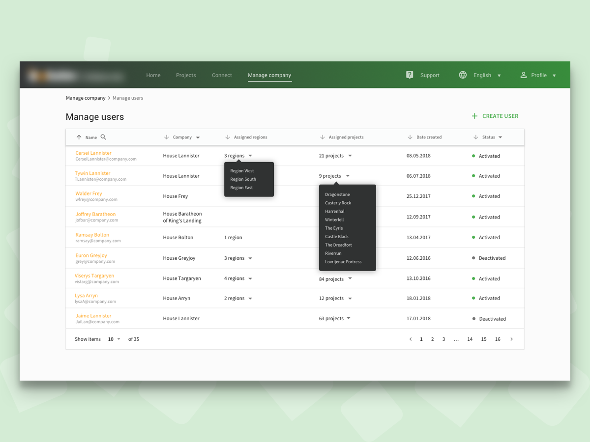
Source: User administration dashboard
- It’s better to keep designing in the end
Last but not least, designing an admin dashboard template is exciting. Designers often do it before anything else, but it’s better if it’s done at the end.
As a dashboard is the summary of the whole process that displays key information from several areas of the application, designing it, at last, seems like a more practical approach. Let’s say you have designed your dashboard, and now, you will work on other pages. In this case, every time you make a change in your applications, you will have to go back and update your dashboard. Also, after you’re done with designing most of the views, you will have several components to work on when completing your dashboard design.
Conclusion
Whatever you do, make sure that your dashboard looks fantastic. The dashboard needs to look good as well as prove beneficial for your users and their business needs.
Designing a great dashboard starts with identifying the users’ needs and ends with offering a solution to every area of concern. It delivers a more profound comprehension than a simple report and tells stories that can transform your business.
It might take a while to get it right, but you need to persist. Eventually, you will nail it.
Author
Sunil Joshi is an avid designer cum developer who is passionate about solving complex UX challenges across digital businesses. He is a trendsetter in the field of data visualization and dashboard design and has been lauded for his clean and minimalist design aesthetic. He co-founded WrapPixel, design and react dashboard template marketplace in 2016 with an aim to bring great design and clean code within easy reach of everyone.